Tips for Preparing Your PowerPoint Presentation
- Tips for Preparing Presentations
- Tips For Saving Prep Time
- Tips to Use When Presenting
- Tips When You Share Presentations
- View a Sample Lesson
These tips are general guides. They are specifically meant for Preachers and Sunday School teachers that use PowerPoint to teach. These recommendations help users to develop effective presentations. They are a good guide for beginners and moderately experienced users. There are times that these rules should be broken. In general, however, you will find that following these guidelines will help make your presentations more effective and avoid the common pitfalls that many people experience.
There is a LOT of information on this page. I recommend that you read it prior to preparing your presentation and then make your presentation. Next, go back and read this guide again and compare these guidelines with your presentation and make corrections as needed.
1. Obey the 5 BY 5 Rule
The five by five rule is to limit yourself to five lines of text per slide and no more than 5 words per line. Following the 5x5 rule is a common practice of professional presenters. Most beginners like to fill their slides with text. In general, doing so is a BIG mistake. A similar "rule" to the 5x5 rule is that slides should be able to be read in less than 7 seconds. The bottom line is that the material that you put on your slides should only be your main points and not everything that you want to say.
 Although everyone breaks the 5x5 rule on occasion, you should take care to make sure that the bulk of your PowerPoint slides fit the rule. In general, if you have more than can be put on these five lines then you should put the additional text on a second or third slide. There are a LOT of reasons for this. The most important having to do with control of the presentation. The bottom line is that when a new slide goes to the screen then people’s attention goes to the slide and away from the speaker. During that transition time, a large percentage of people will NOT hear what you are saying. You should only put a lot of text on the screen when you want the people to read the slide and NOT listen to you.
 - If you are going to put a long text on the screen then you should be planning to stop elaborating and either have yourself read the text aloud or have a member of the audience to read the text aloud. An acceptable reason to break the 5x5 rule might be in putting scripture text on the screen. In that case, it may be acceptable to put up to 12 lines on the screen in a 32 point bold font.
- A lot more could be written about why keeping your slides short and to the point is the best thing to do. In general "less is more" when deciding what text to put on your slides.
2. Font Tips: Keep the font sizes of your title lines greater than 42 points and of your general text at 36 point or larger.
On occasion, you can run your text size down to as low as 32 points. In general, it is good to have your titles running around 60 points if possible.
- The most common mistake of beginners is to use fonts that are too small. It may also be a good idea to even use bold fonts if possible. Although you might almost never use all bold fonts on a webpage or a printed document, you might consider using ALL bold fonts in presentations. This mostly has to do with the current state of presentation technology and the way that electronic projectors are commonly used in churches. The bottom line is that the projector systems of many churches are still marginal in terms of brightness and contrast. Bold fonts gives more width and density to letter shapes, thus improving legibility. This can be particularly important when using PC to TV converters since these devices may drop out portions of letters due to interpolation. The bottom line is that probably the #1 most frequent complaint given when audiences are quizzed about what they don’t like about digitally projected material is that the text is too small or too hard to read.
Think about your audience! Not everyone can see well. This is a particular problem for older folks. Even a lot of younger folks have vision problems that you may not be aware of - and likely, they won’t tell you unless you ask them.
If you are going to use bold fonts then what do you do when you need to emphasize some text? When I want to emphasize a point then I either use a different color for the font, italicize the text or underline it. Sometimes I combine all three! You are not limited to black and white printed text, color can be a powerful tool - use it!
Don’t be afraid to use fonts that are big and bold! If you are following the 5x5 rule you will have plenty of space for large fonts. Prior to presenting your lesson, it is a good practice to put a slide on the screen with the smallest font in your slide show. How well can it be read from the worst seat in the house? Think about things from your audience’s point of view.
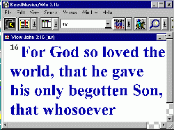
3. Don't Put Every Scripture Text on the Screen
In general, it is best not to use your computer to put all of your scripture texts on the screen. The reason for this doesn’t have as much to do with presentation as it has to do with the learning needs of the audience. People who have been using projectors to teach in church for several years have noted that if you show all of your scripture texts on the big screen is that after a while, many in your congregation may quit using or even bringing their Bibles to church! The bottom line is that you should use the technology to encourage people to study their Bibles more, not less.
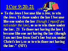
There are several ways to encourage people to bring and use their Bibles. If the text is longer than what will fit on one slide then consider simply listing the Bible reference on the screen and ask people to turn in their Bibles to the scripture stated. This is a great time to ask someone to read the verse aloud for you. Another way to get people to use their Bibles is when it comes to comparing versions. If you show one version of the Bible on your screen, you can ask a member to read an alternate version when that is useful when studying the text. Using members to read also gives variety to the class and gives the speaker a short break from speaking.
Remember . . . even though it may be easy to use your Bible software to switch versions and easy to show Bible text there are times that you should resist the urge! One difference between beginners and seasoned presenters is the realization that just because you can do something doesn't mean that you should!
If you are concerned about unchurched visitors having a hard time keeping up with scripture references and your church is equipped with "pew Bibles" then simply put the page number next to the scripture reference so that your visitors can follow along more easily with the Bibles. In the meantime, keep encouraging your members to use their Bibles.
4. Contrast Your Text and Background Colors
 Make sure that you either use dark text on light colored backgrounds or light colored text on dark backgrounds. High contrast between text and background colors can be very important to people trying to read the text. Red text on a blue background or blue text on black background may look fine on your computer screen but your audience may not be able to read it at all when projected with an electronic projector. This is also an important consideration when picking background pictures. Generally, you should pick background images with large blocks of either dark or light colors that are big enough to fit your text in. If you don’t do this and have dark text run across a dark area of the screen or light colored text run across a light area then whole words may disappear to your audience. The text and image may look fine on your computer monitor and become totally illegible when projected due to the difference between monitors and projectors.
Beginners often want to use black text on white screens for their PowerPoint type presentations. This is probably due to thinking about electronic projectors as though they were old time overhead projectors and transparencies. Black text on a white background is great for paper handouts and OK for computer screens, web pages and overhead projectors but most professional graphics experts state that light colored text on a dark background may be better for electronic projectors. There is some disagreement about this recommendation. Color selection can be affected by the room lighting in the place that you are showing your slides. The best thing to do is just to simply make up some sample slides and try them out for yourself. If you do pick light colored text on dark backgrounds then when you print out your slides then you will use LOTS of ink. If you are going to print out such electronic slides as handouts for your class then its usually a good idea to pick the "Black and White only" option that comes up on your PowerPoint print menu. This will not only save you lots of ink but it will make an image that is easier to photocopy.
A black background may look great on your computer screen or even on a TV screen but pure black background screens should generally be avoided when using electronic projectors. The reason for this is that the color black cannot be projected! The color black just means that your projector LCD or DLP electronics are blocking light being projected on the screen. As a result, your audience may not even be able to tell where the edge of your slide is. It is generally better to pick some dark color rather than black if you want a dark background.
5. Use Shadows for Improved Legibility
PowerPoint will allow you to add shadowing to your fonts. In addition to giving your text a more polished look, shadows generally also improve the legibility of your fonts by giving them more contrast to their background. This is especially important when using photo images as backgrounds. Photos sometimes don’t give your background a consistent dark or light image. Shadows added to your fonts will help assure that light colored fonts are set on a dark background and dark colored fonts are set on a light background for improved contrast. There are several ways to add shadows to your fonts. To learn how to add shadow to a font simply click on the help button in PowerPoint, select index and type in the word "shadow."
My PowerPoint tip is that beginners should use shadows on all fonts all the time. In reality, there are times that shadows should not be used but that should be the exception rather than the rule. Shadows generally improve legibility and give a more "polished" look to the presentation.
More PowerPoint Tips
- Tips for Preparing Presentations
- Tips For Saving Prep Time
- Tips to Use When Presenting
- Tips When You Share Presentations
- View a Sample Lesson